Website for Niklas Press’ debut poetry collection Tændt. Coded by Peter Dremstrup
Author Archives: lucasperch
Arentoft Digital
Identity for Arentoft Digital, an agency specialized in digital marketing and strategy.
Projects
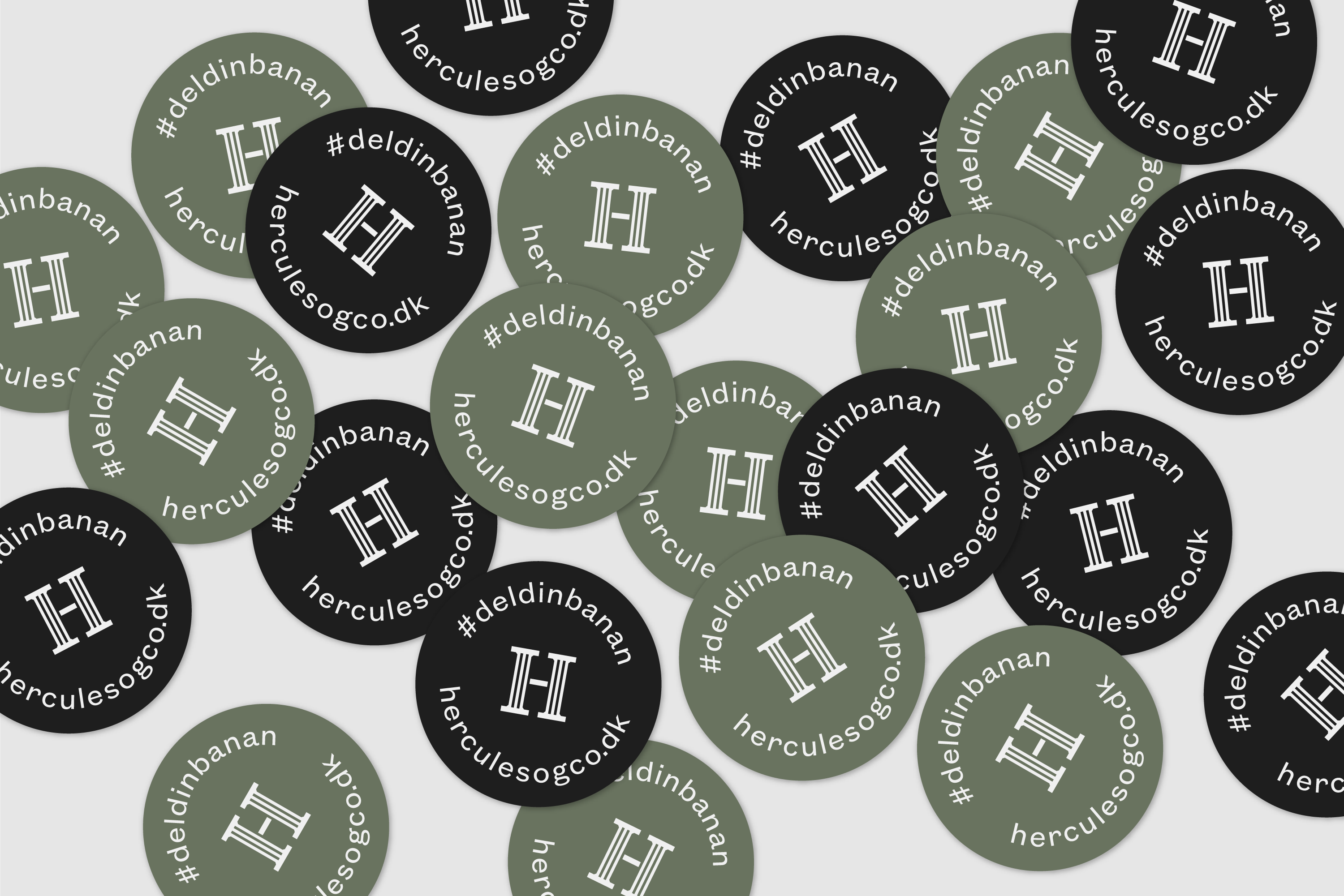
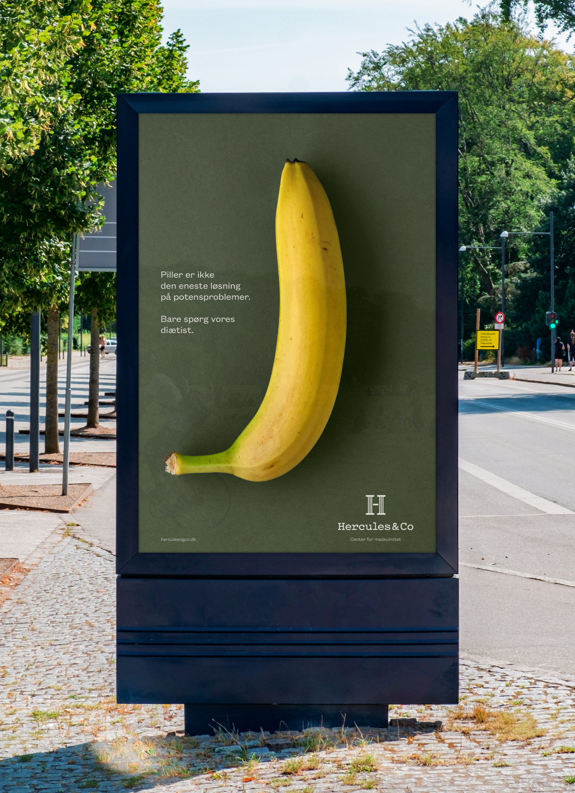
Hercules&Co
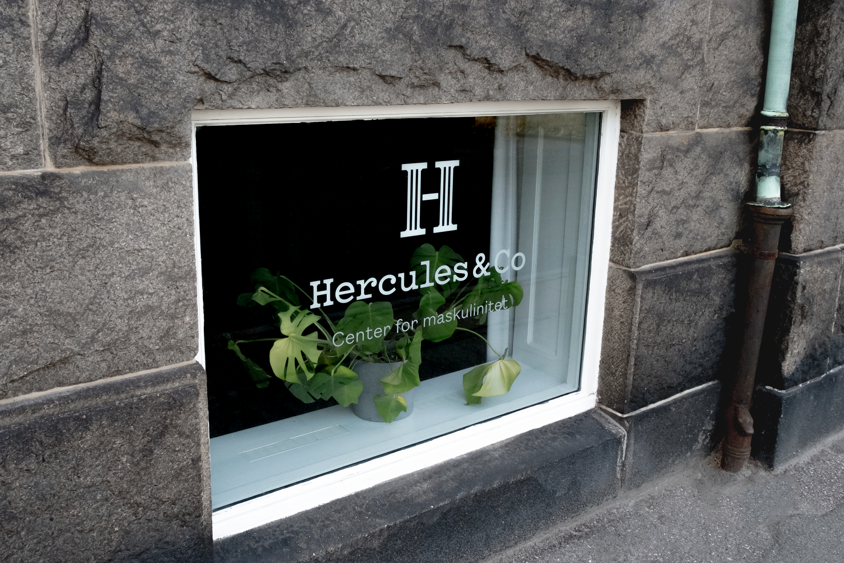
Visual Identity and campaign for Hercules&Co, a clinic where men with erectile dysfunction receive holistic treatment. The design is made in collaboration with Studio Tobias Røder.
Projects
Hövding
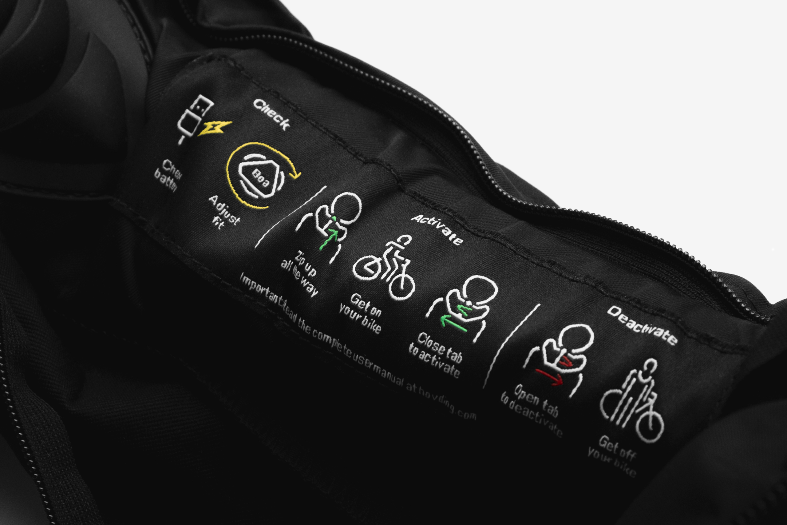
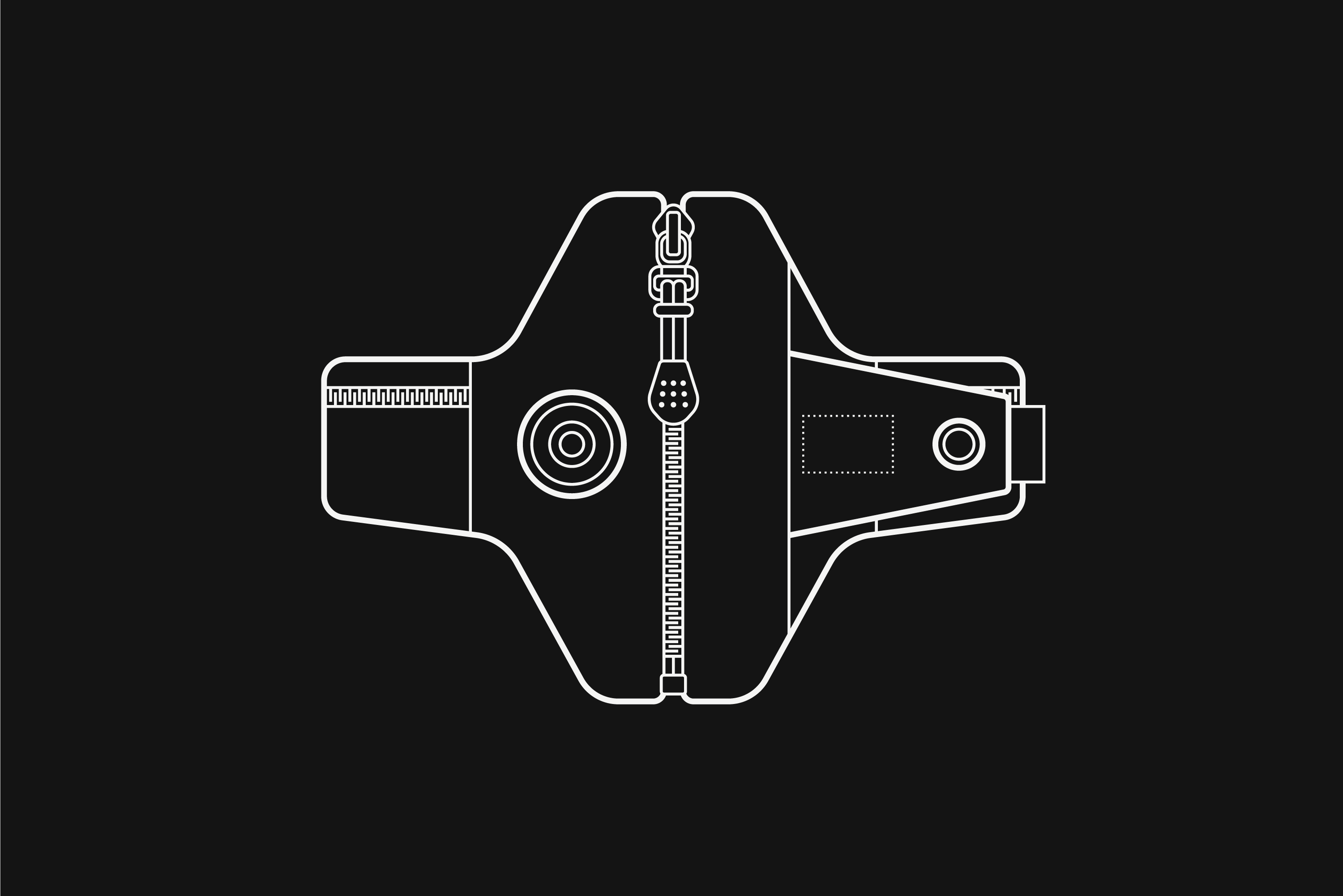
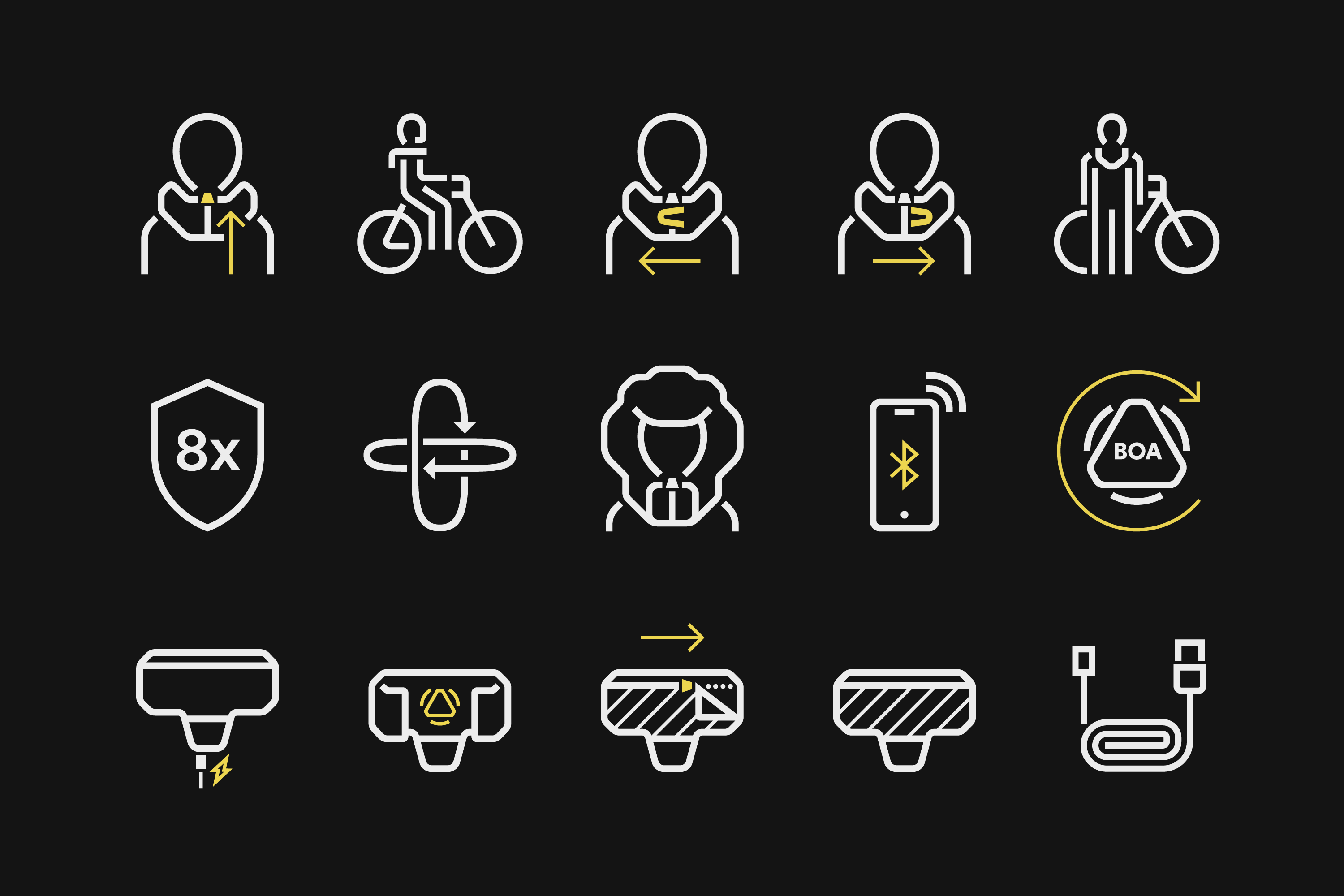
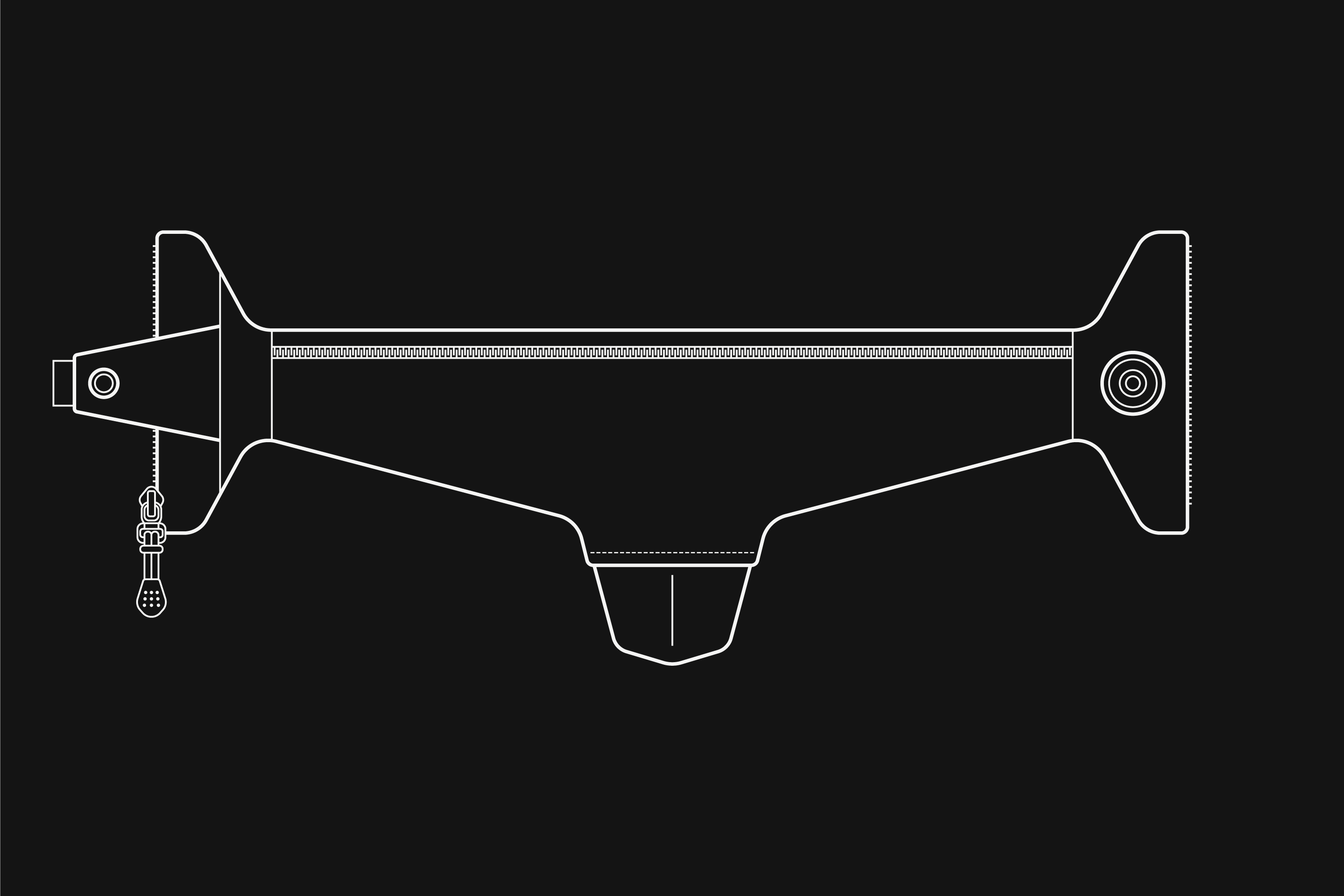
Pictograms and technical illustrations for the Hövding 3.0 airbag and packaging. The design is made in collaboration with Studio Tobias Røder.

Projects
Royal Økologisk
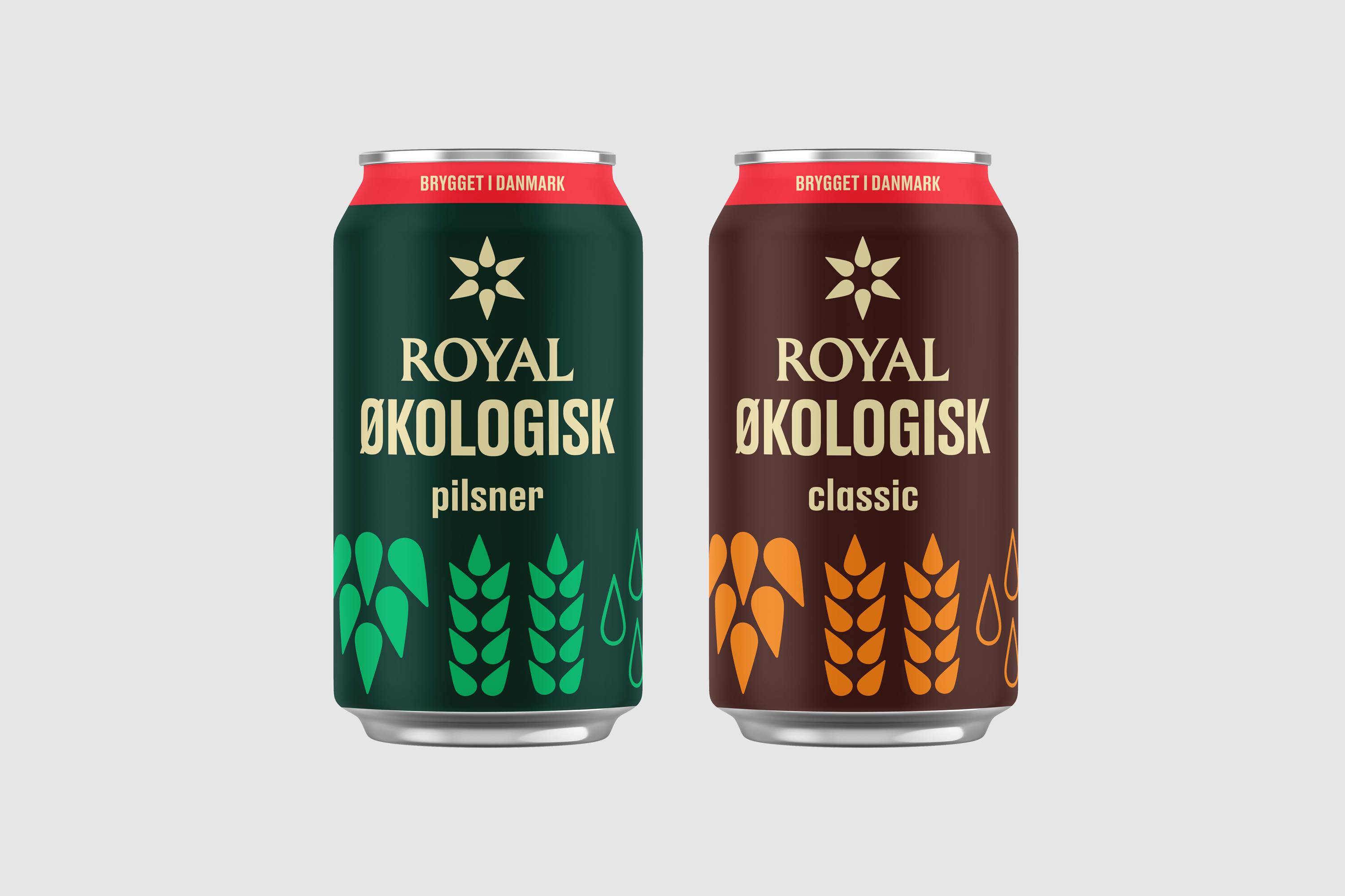
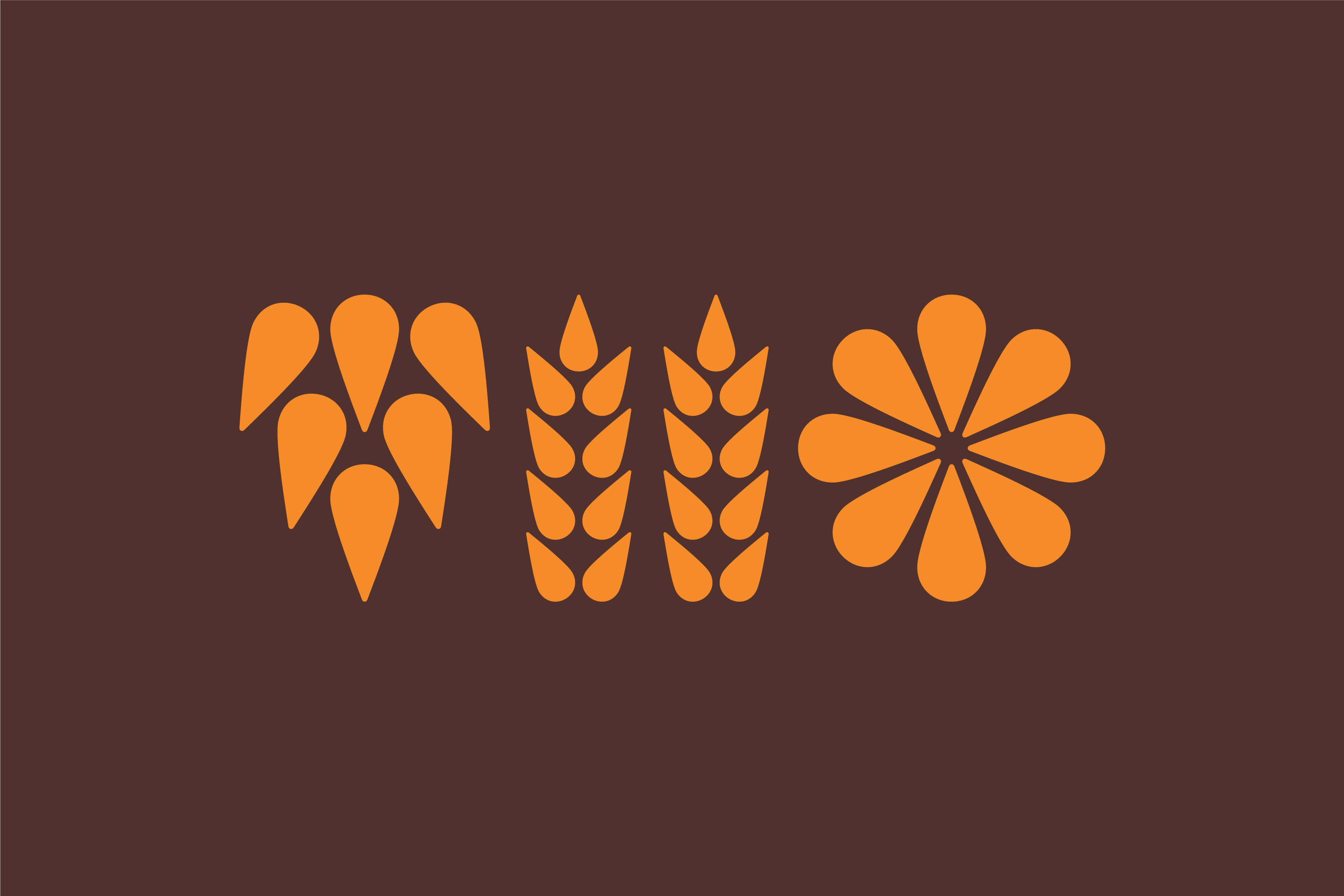
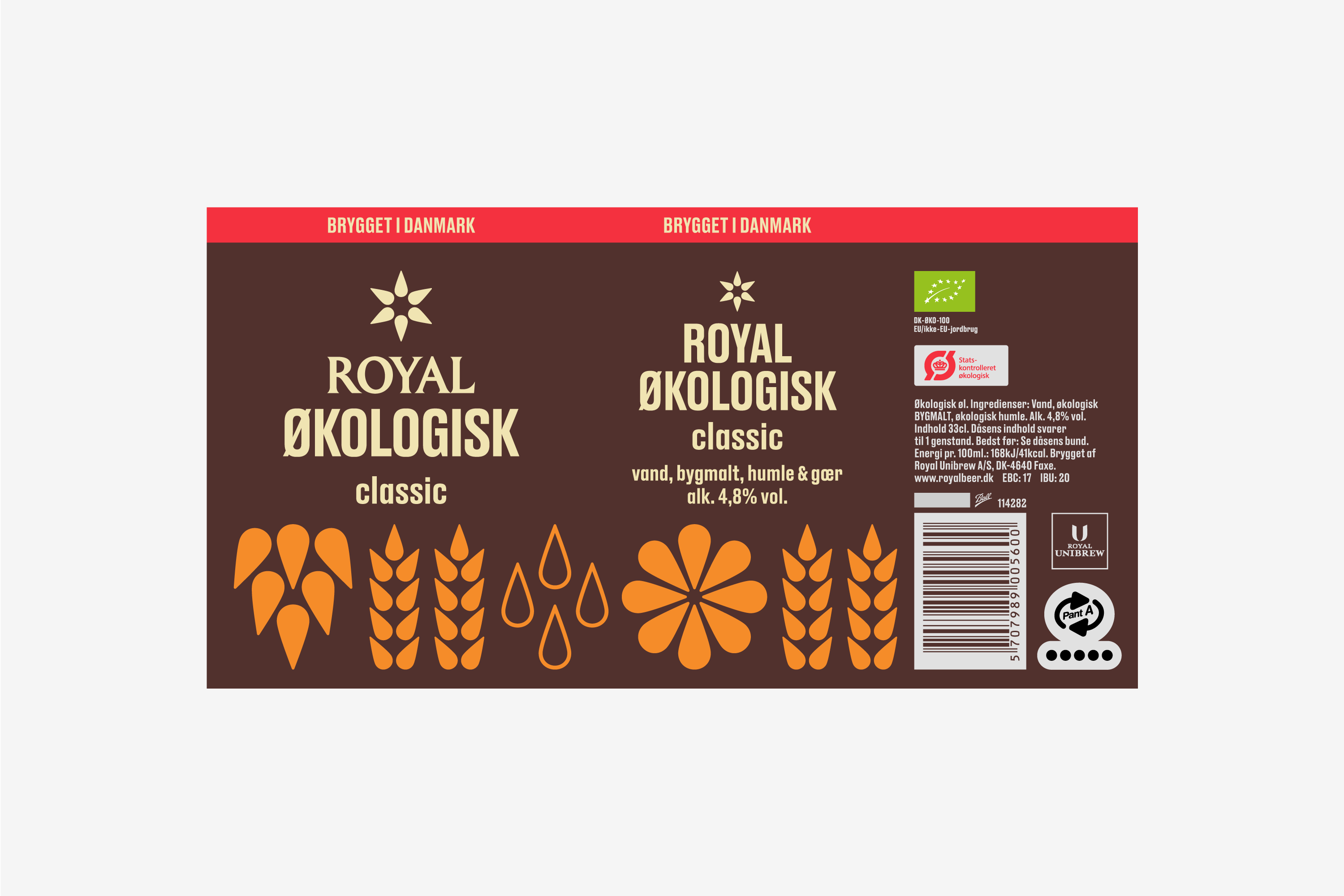
Packaging design for Royal Økologisk produced by Royal Unibrew. The design reflects the craftsmanship of the beer by illustrating its four ingredients: water, malt, hops and yeast. The design is made in collaboration with Studio Tobias Røder.

Projects
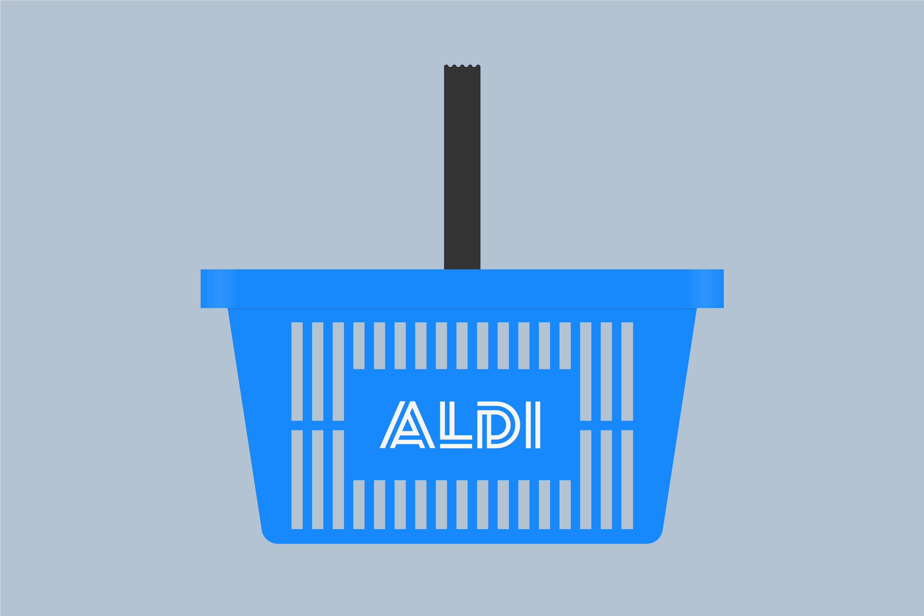
ALDI
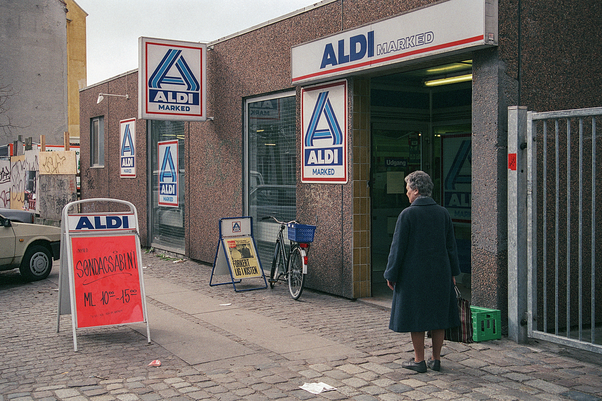
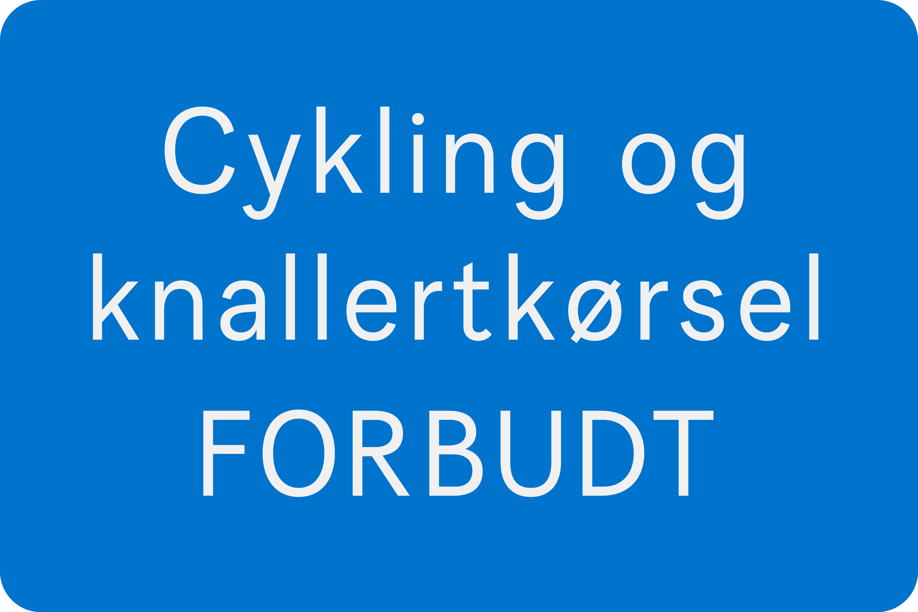
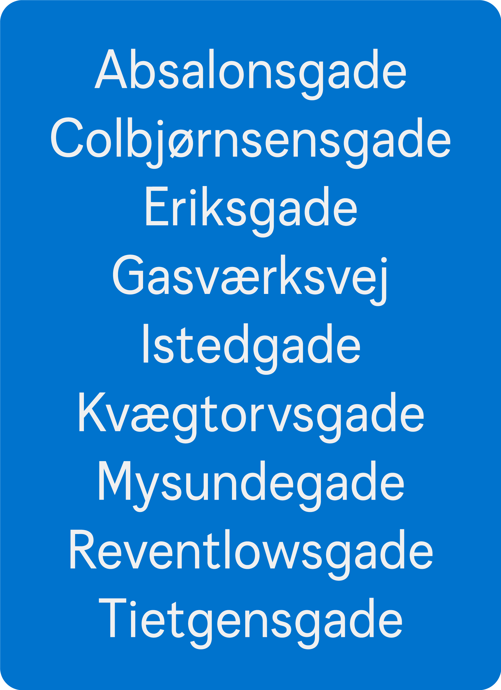
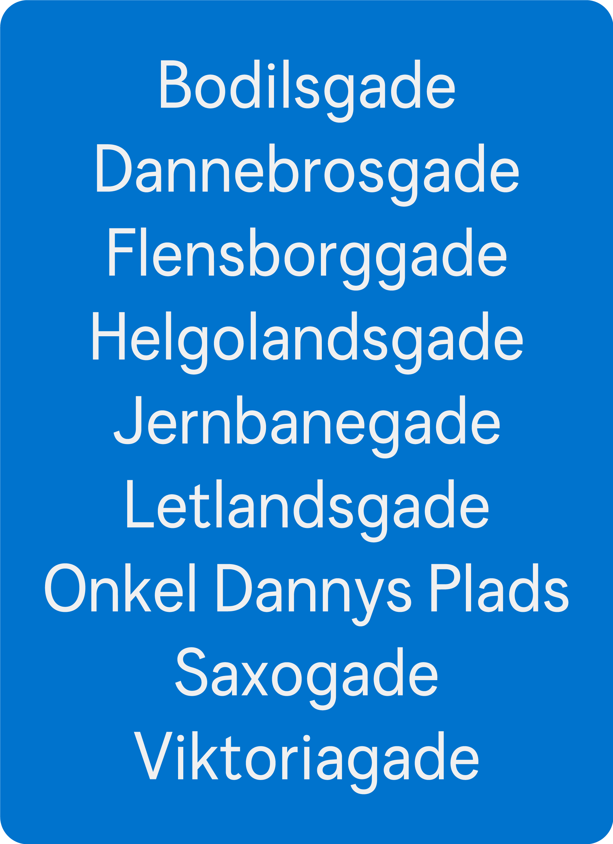
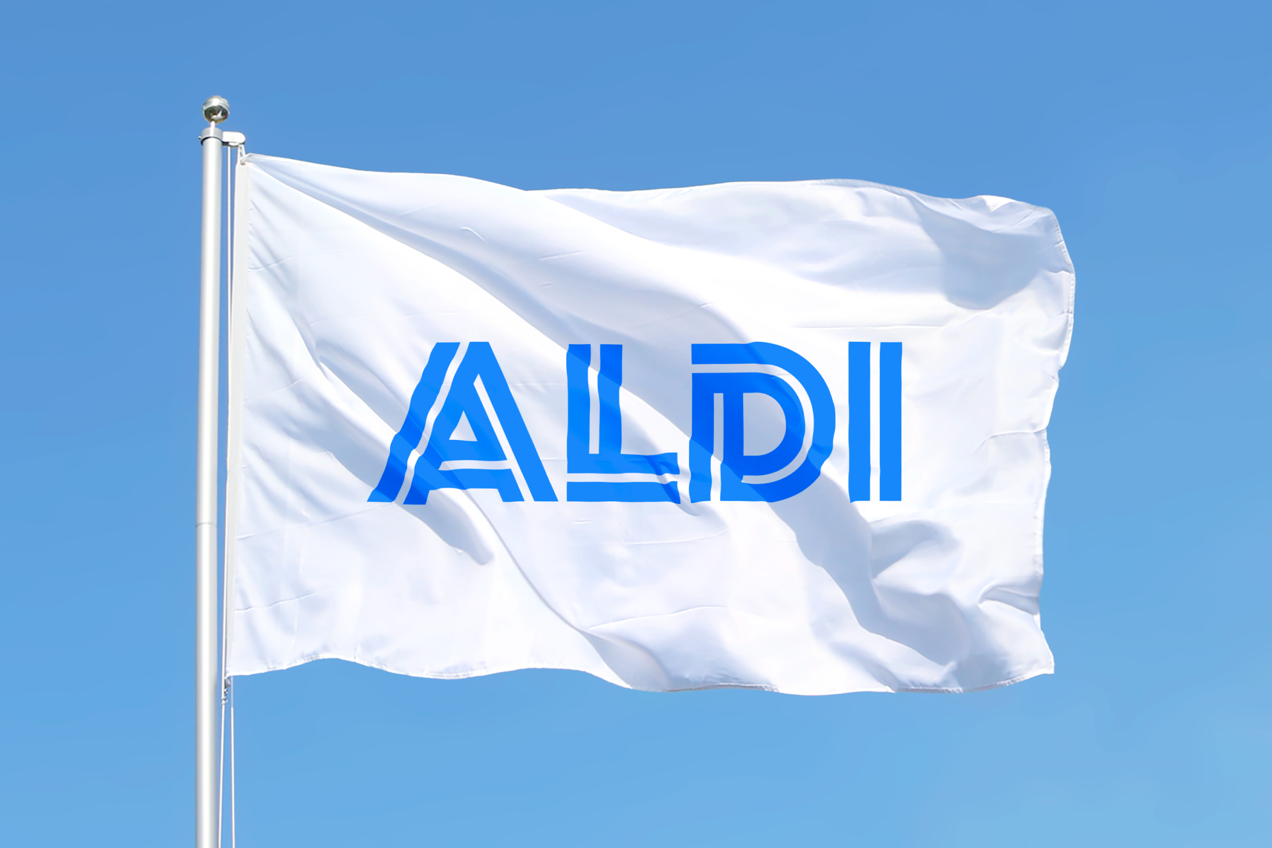
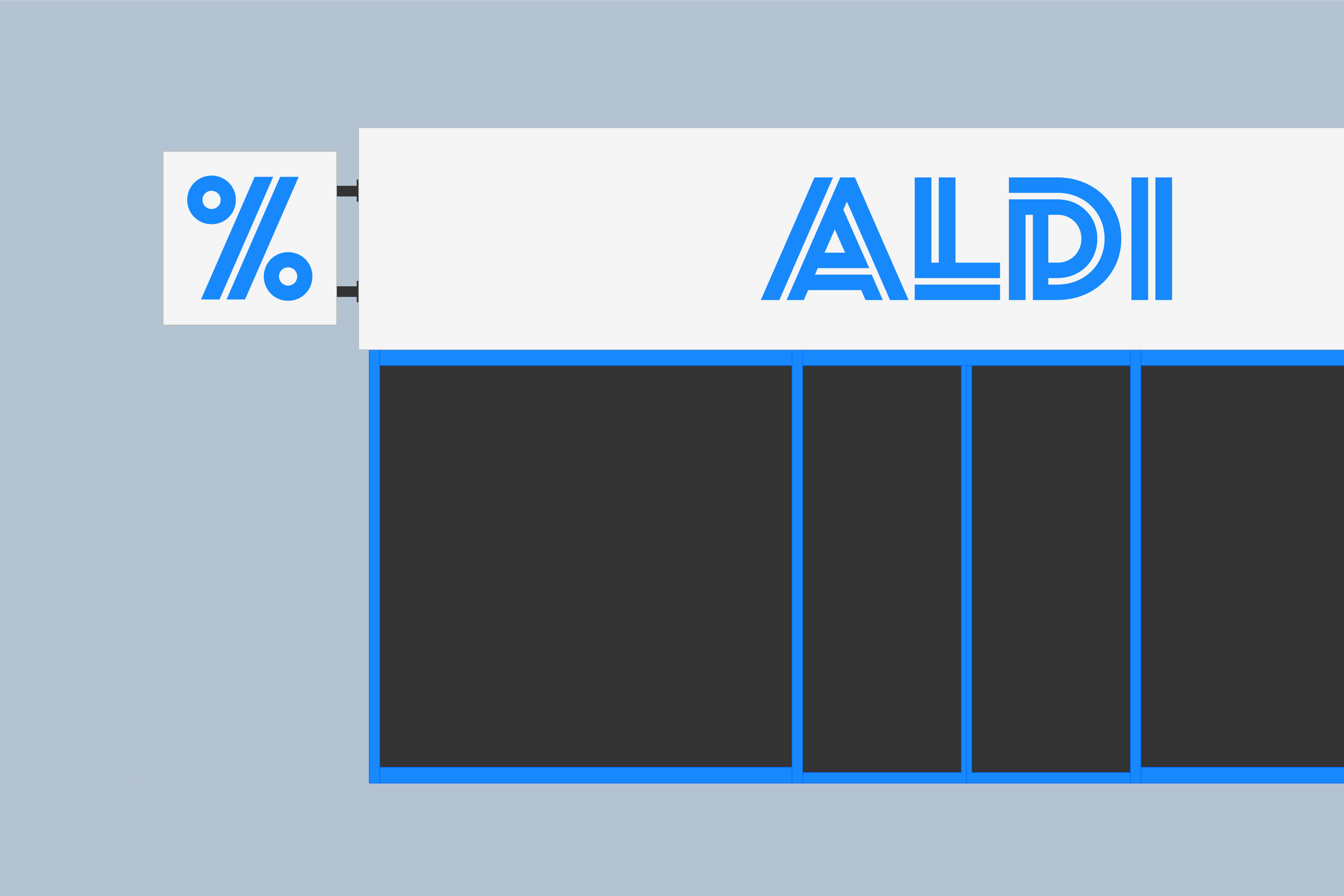
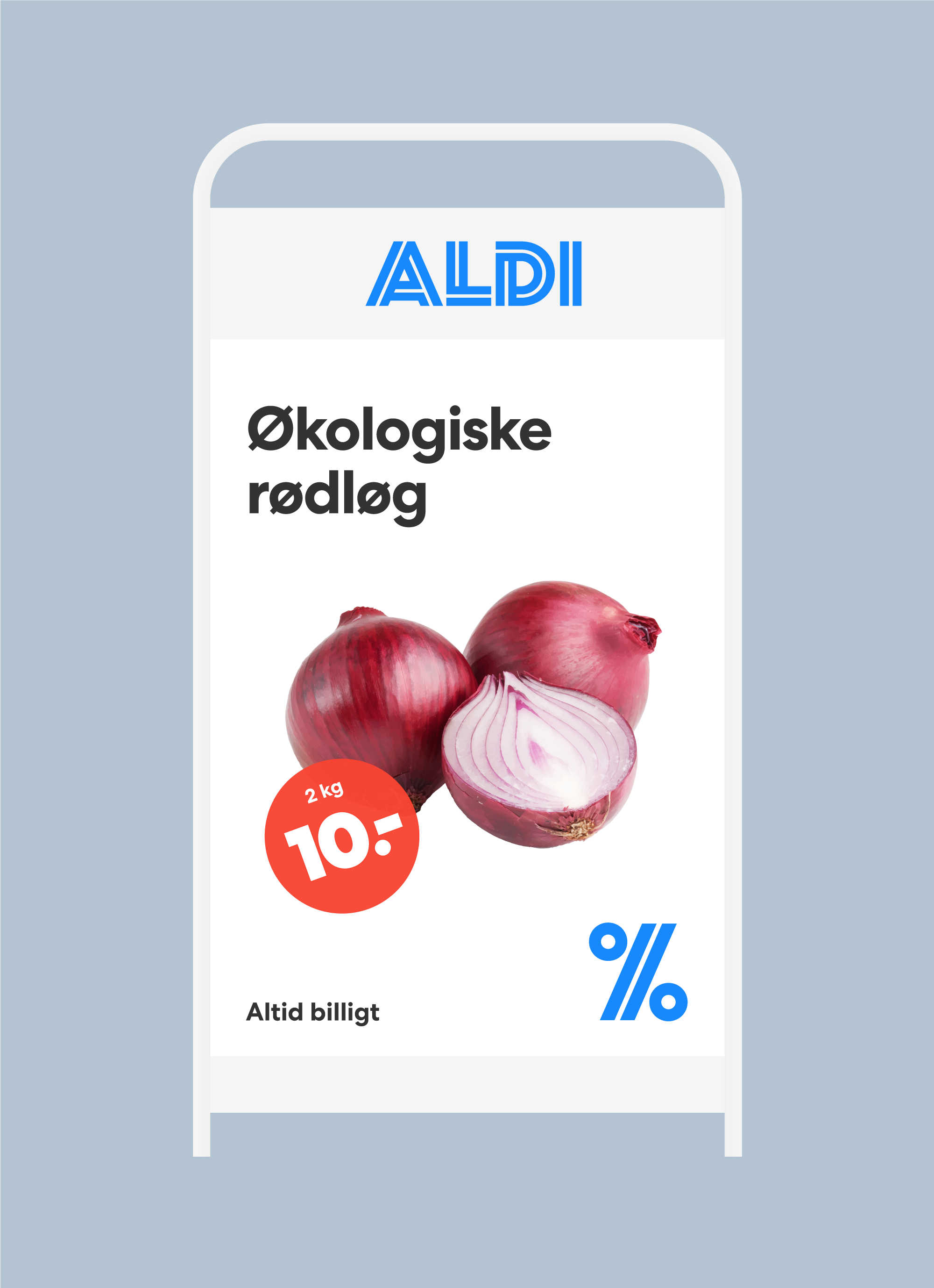
Proposal for a new visual identity for ALDI Denmark in order to create a more modern discount supermarket, that expresses quality products and affordable prices. The intention was to give ALDI Denmark a simple, transparent, and functional visual identity in line with Scandinavian design tradition.
ReferencePAGE Magazine
Projects
Synth
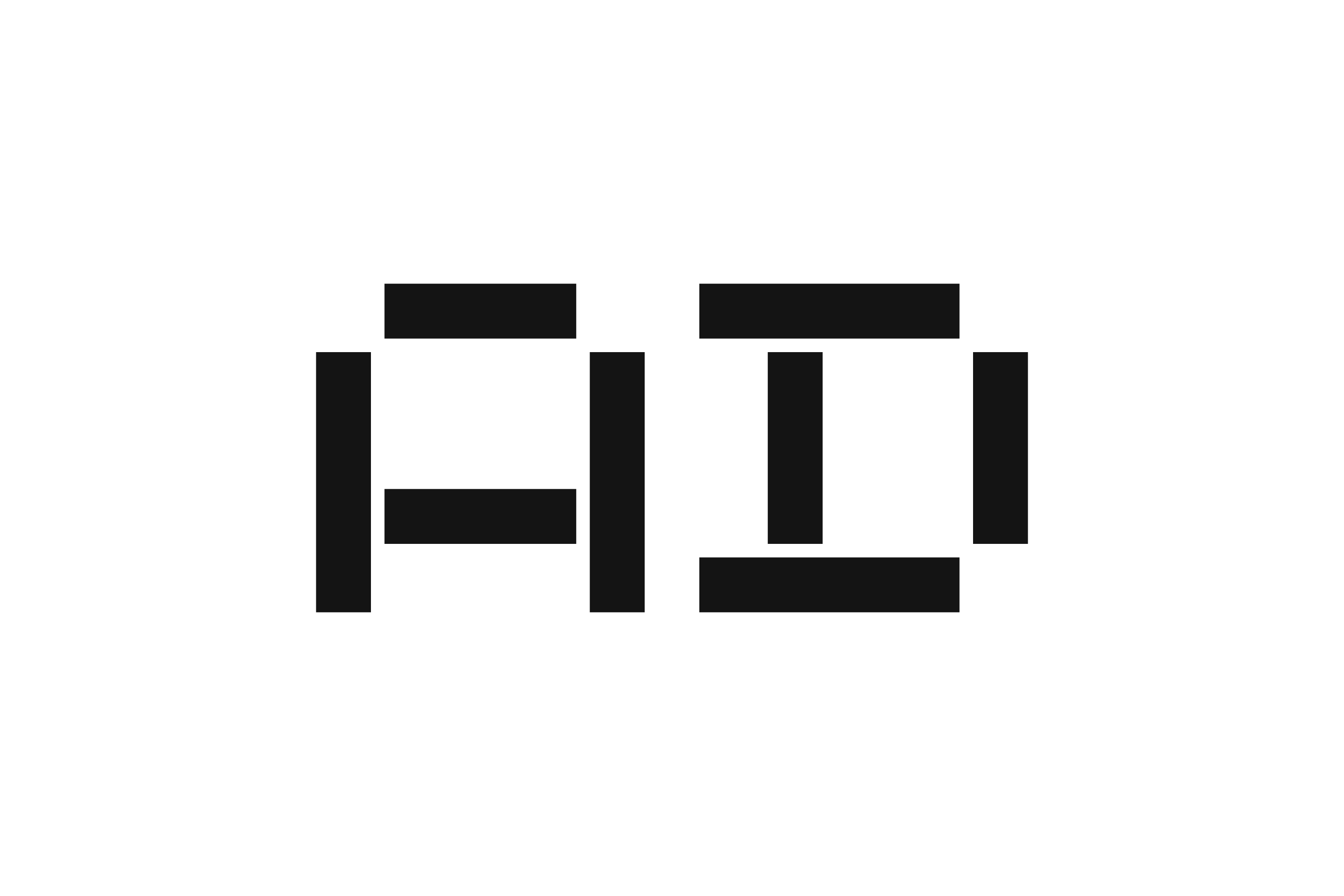
Synth is a conceptual uppercase alphabet based on the three elementary waveforms sine, square and triangular. Synth comes in three versions, which makes it possible to oscillate.
H I J K L M N
O P R S T U V
Projects
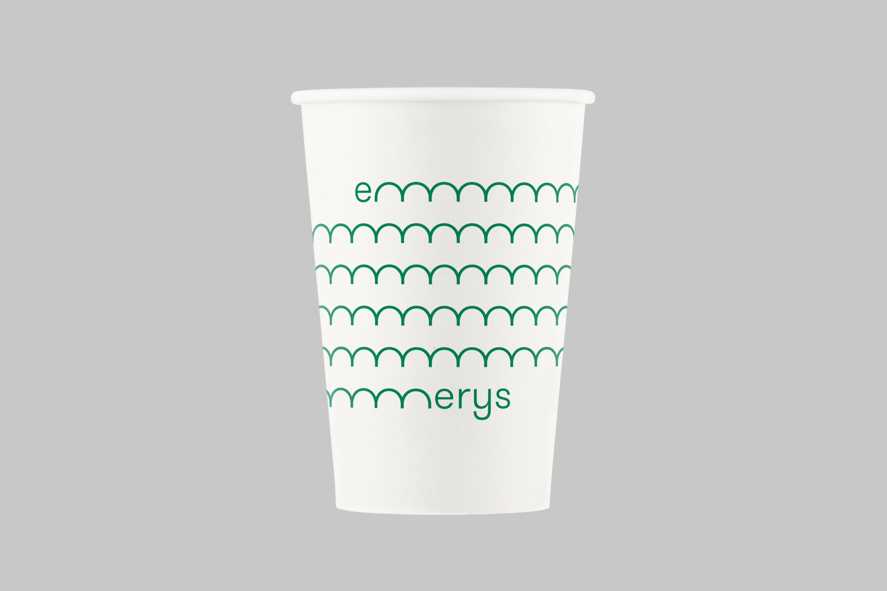
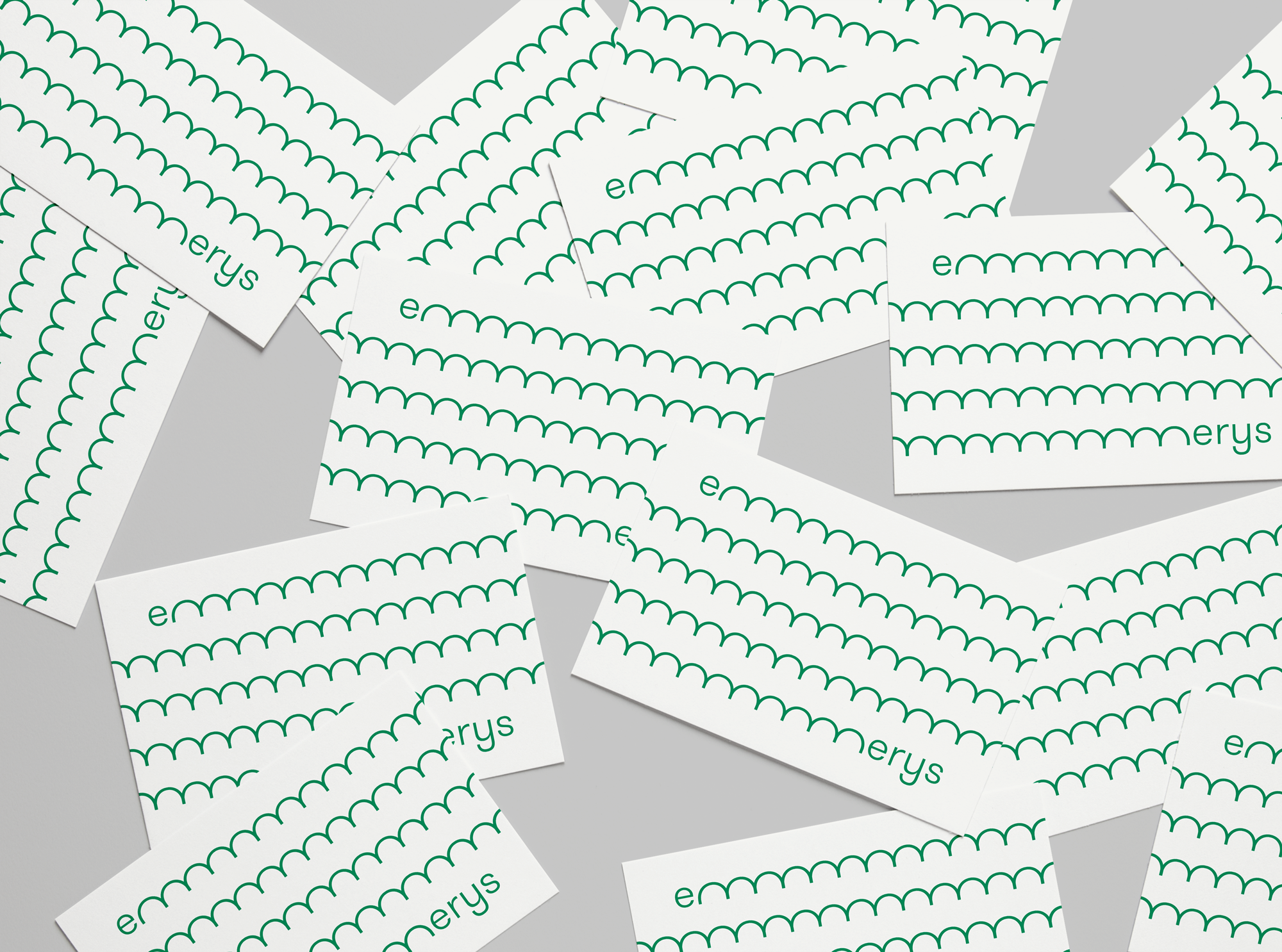
Emmerys
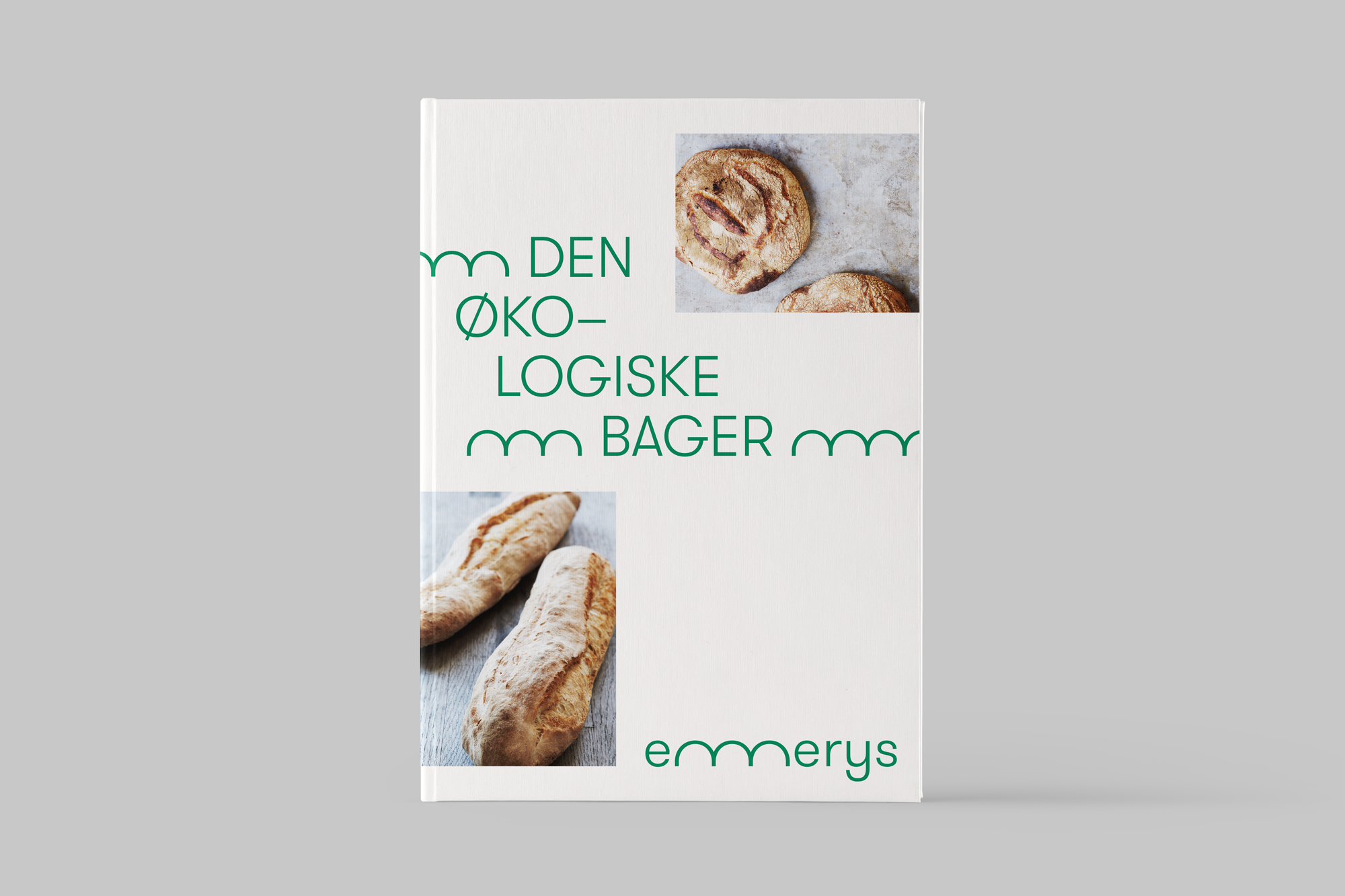
Proposal for a new visual identity for the Danish organic bakery-chain Emmerys. The idea was to give Emmerys a personal visual universe that reflects their passion for 100% organic pastries. The project was made in collaboration with Emmerys.
Projects
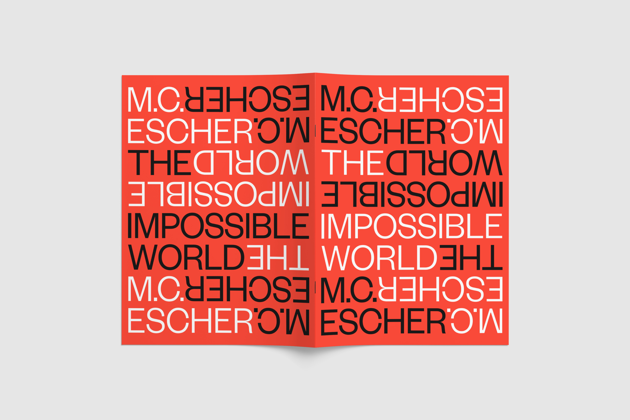
The Impossible World
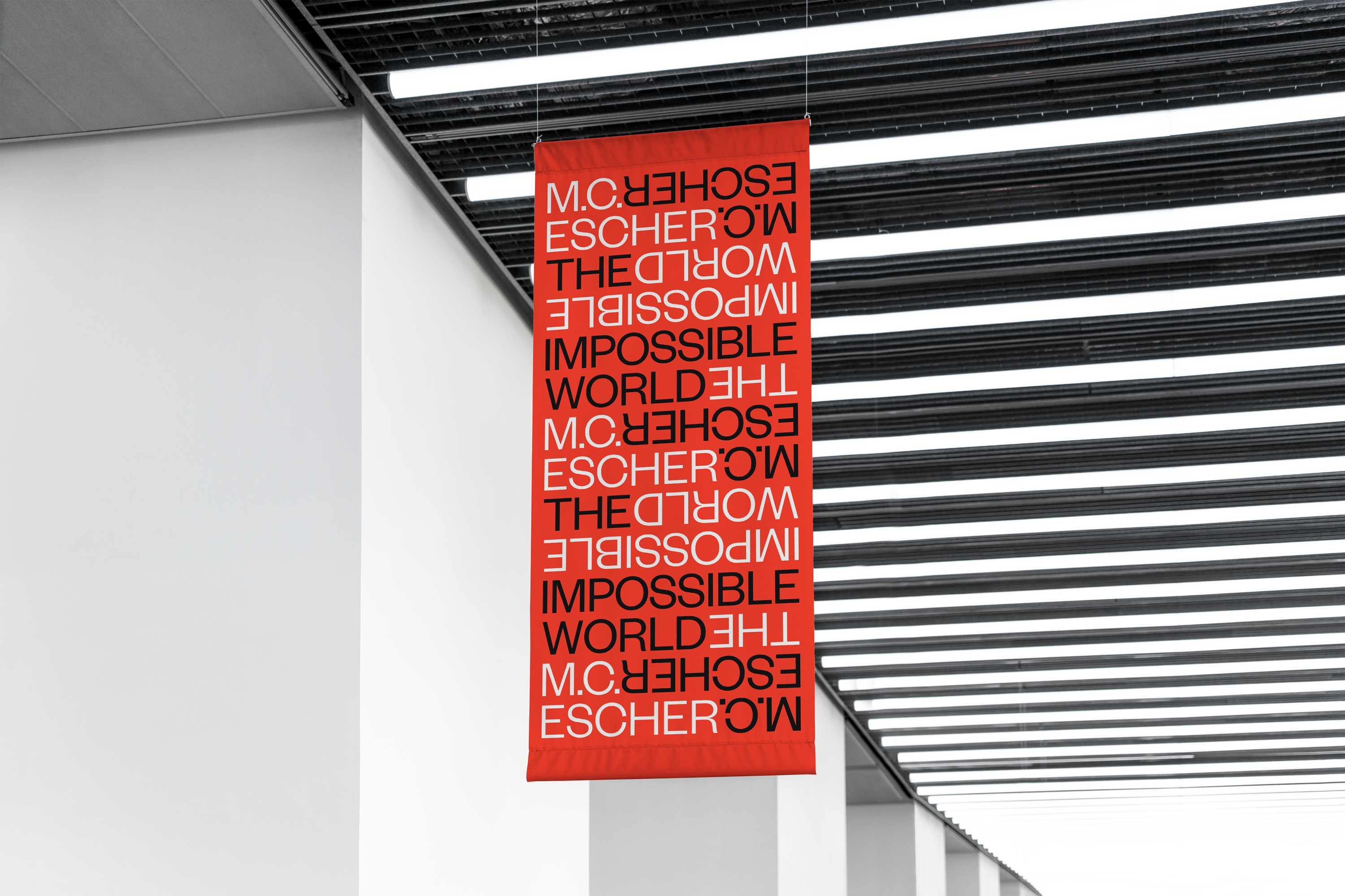
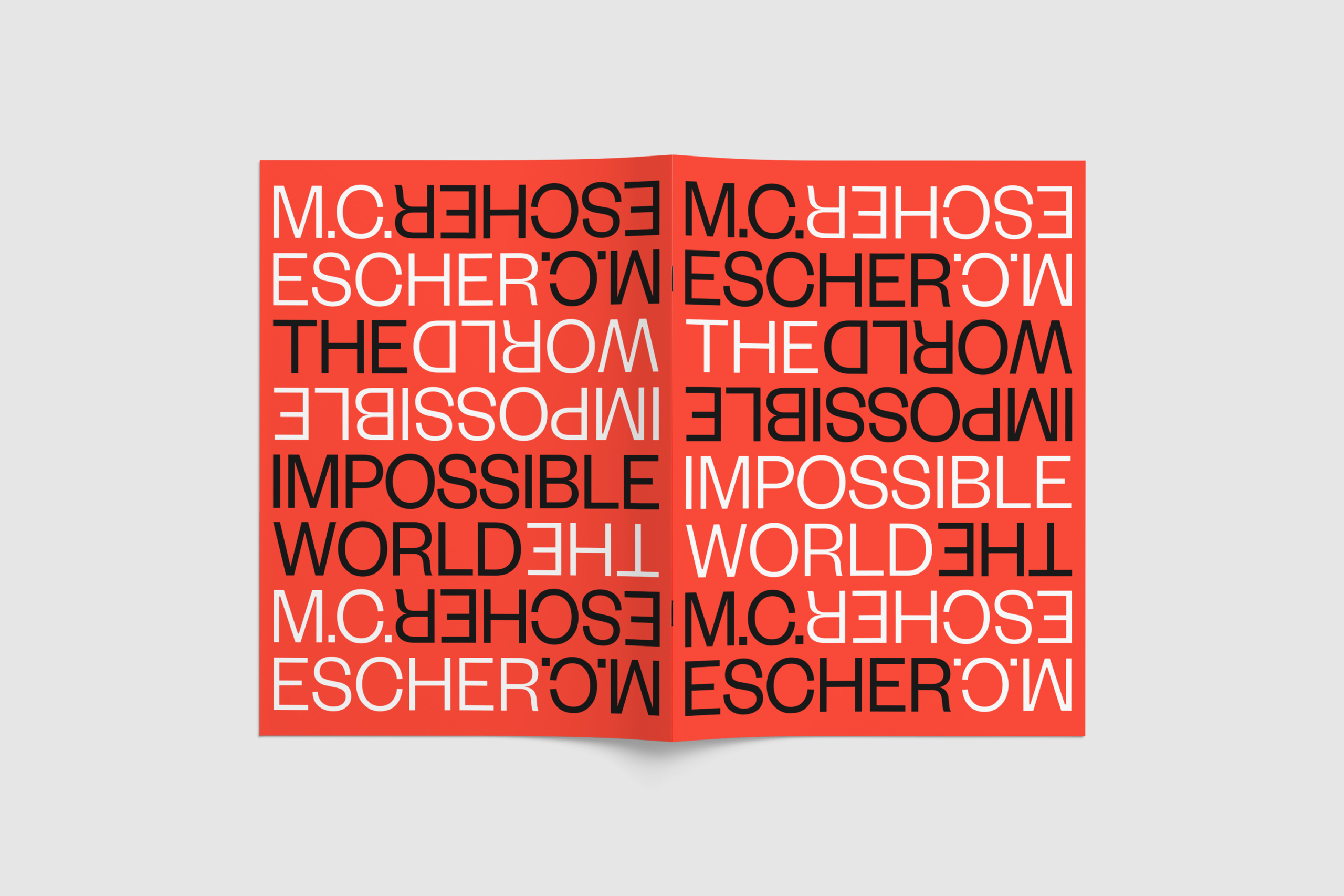
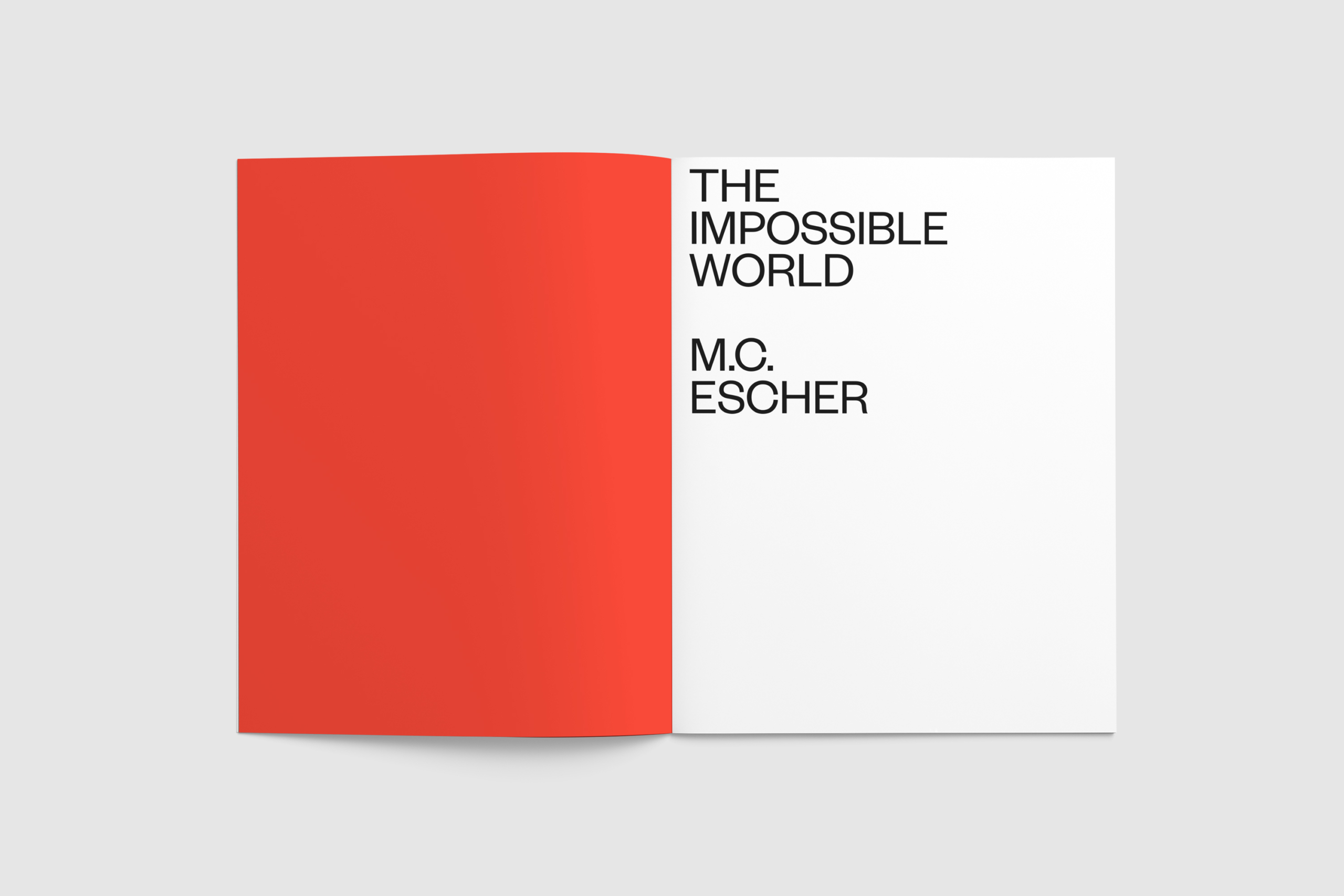
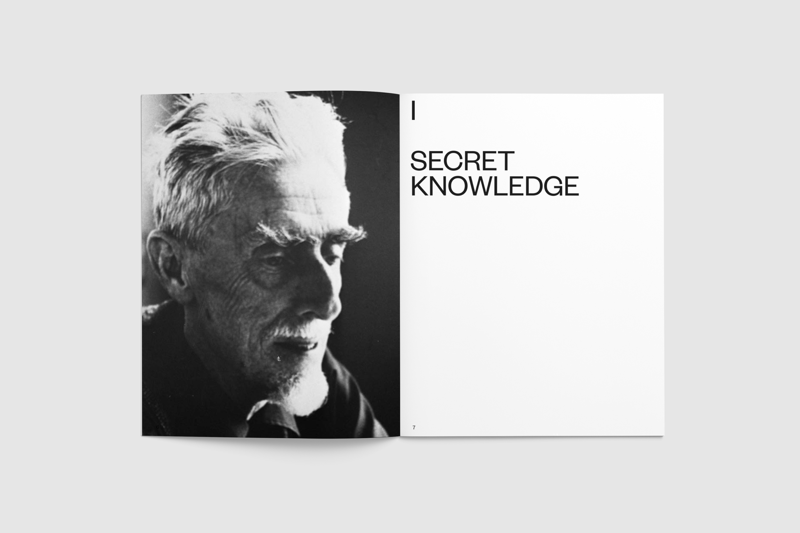
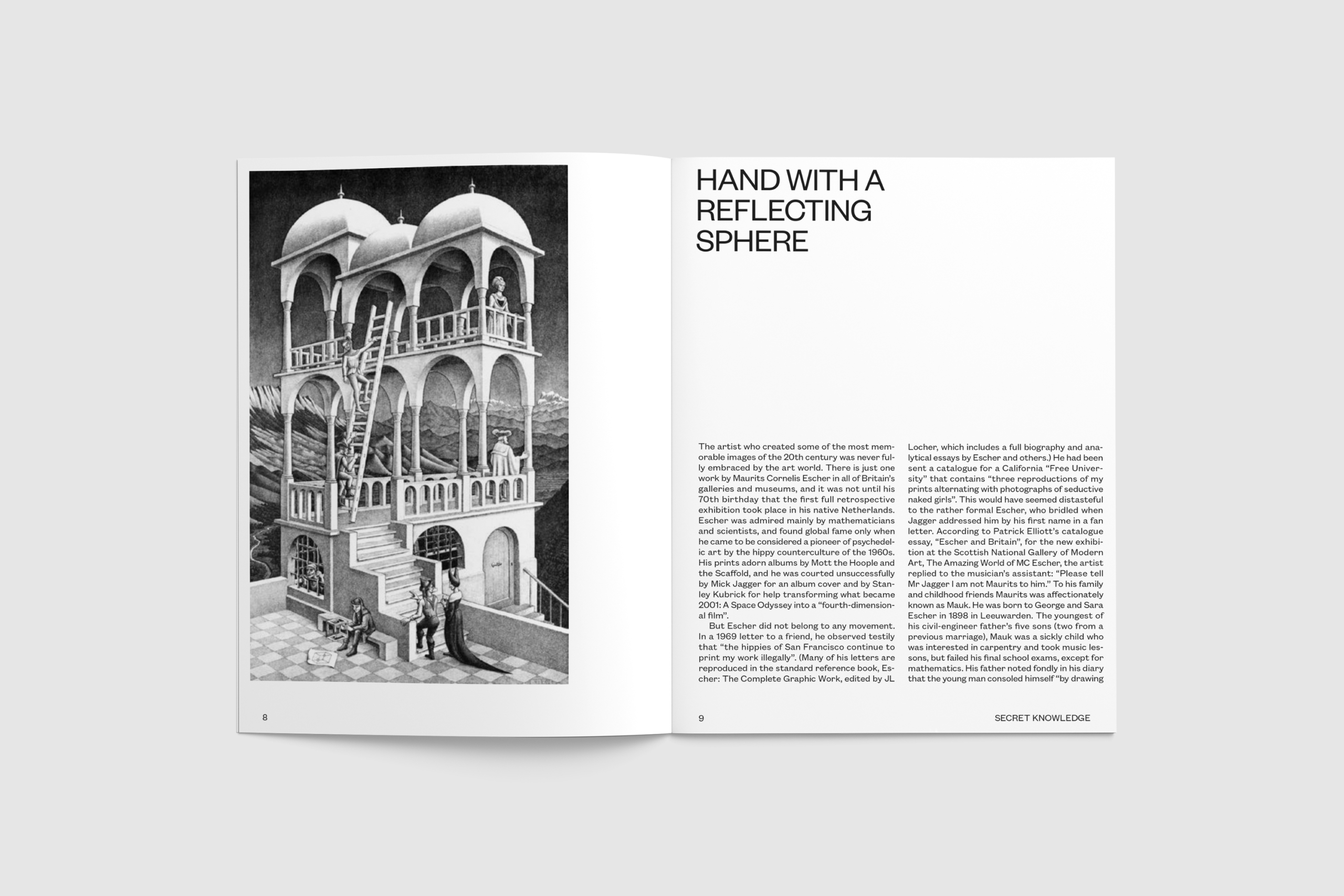
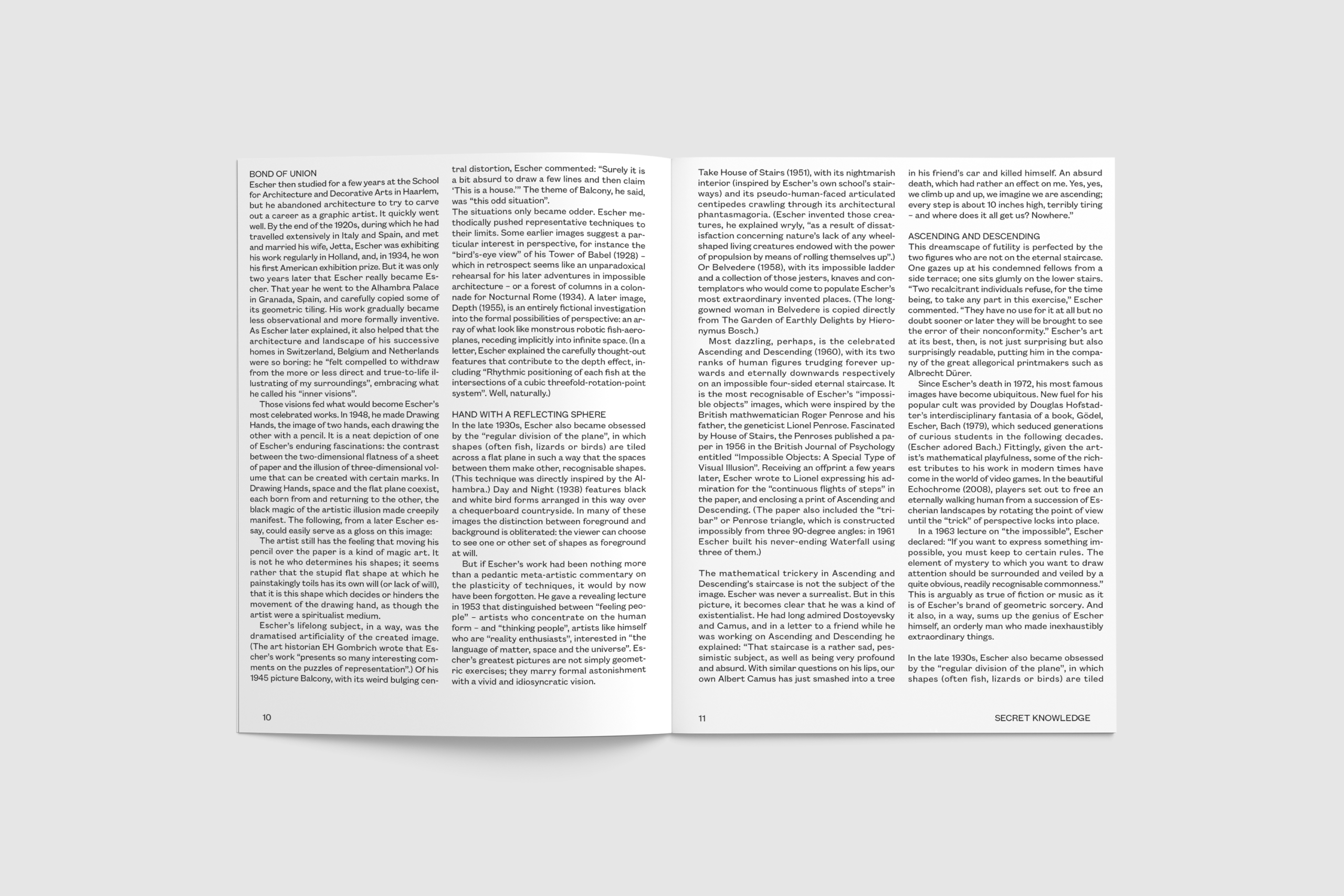
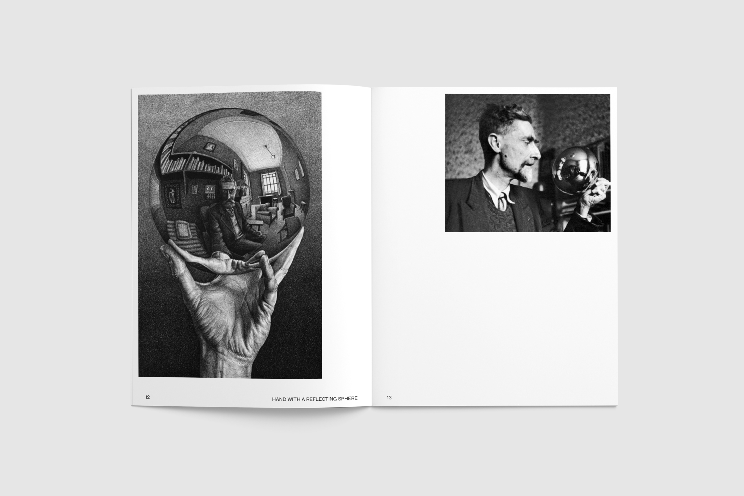
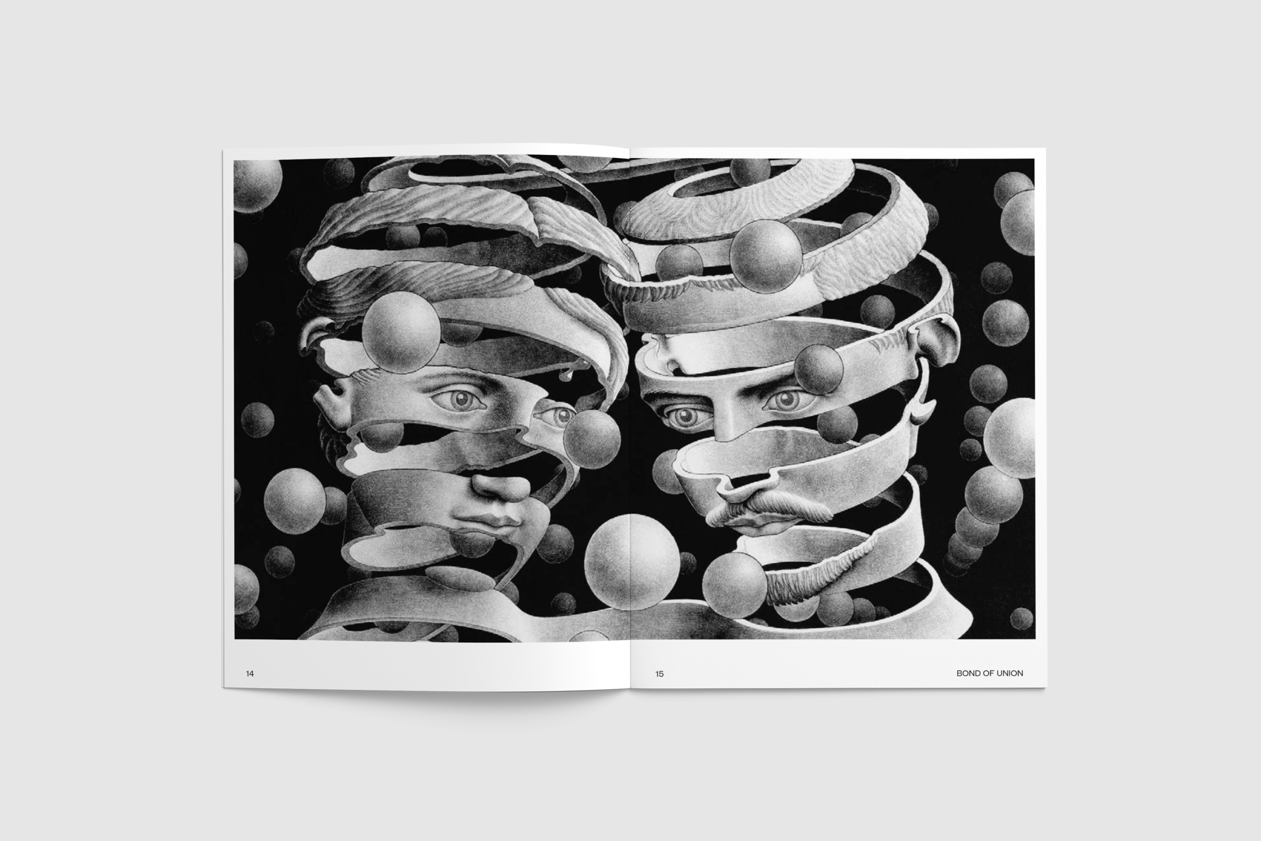
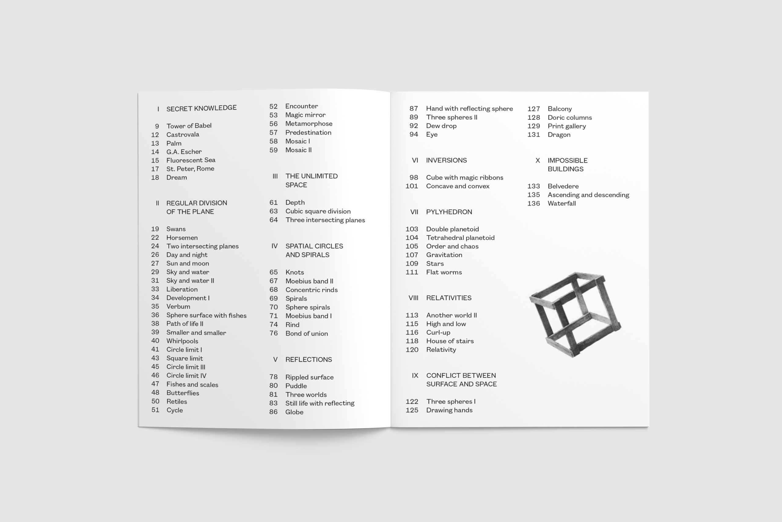
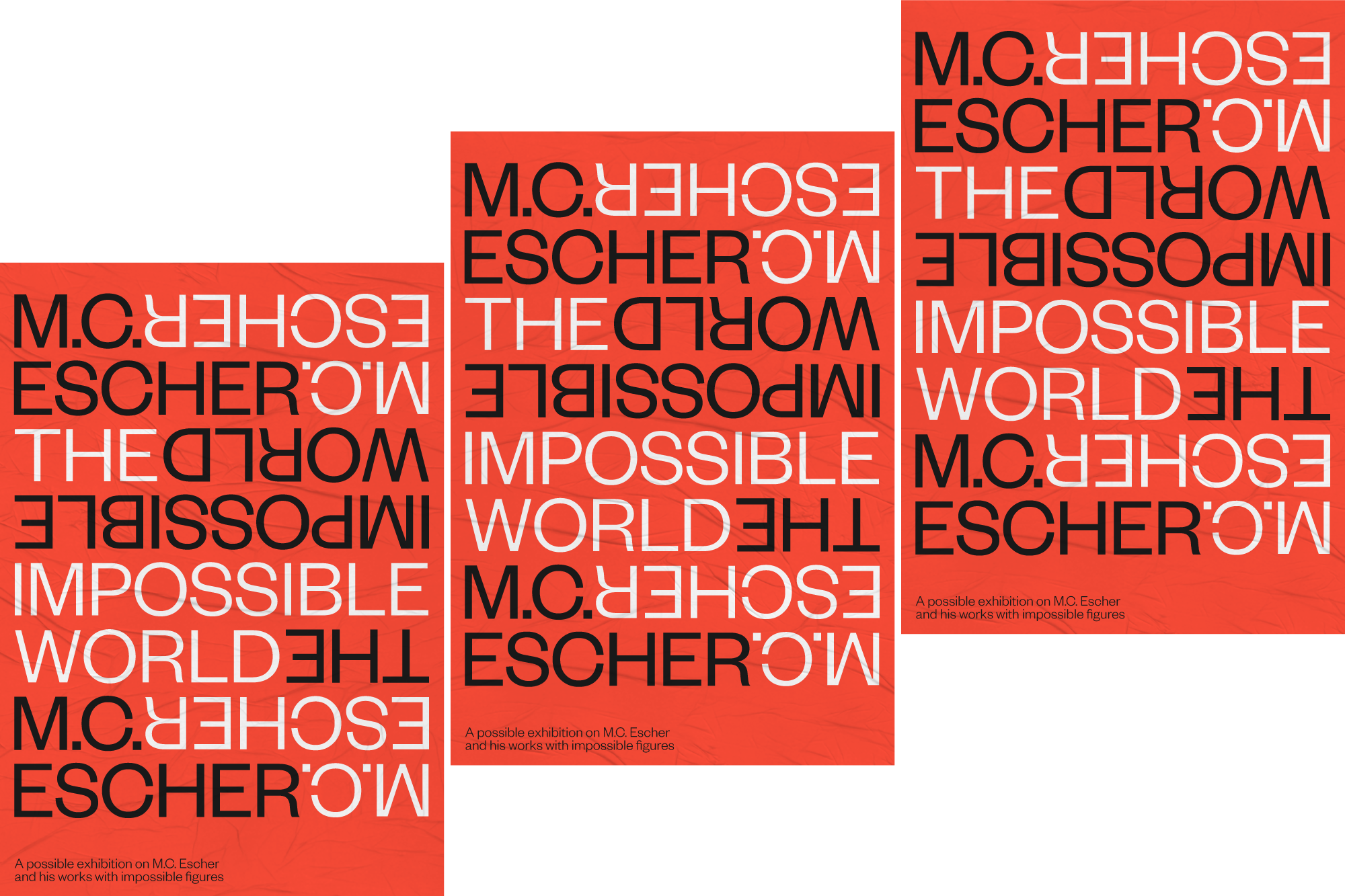
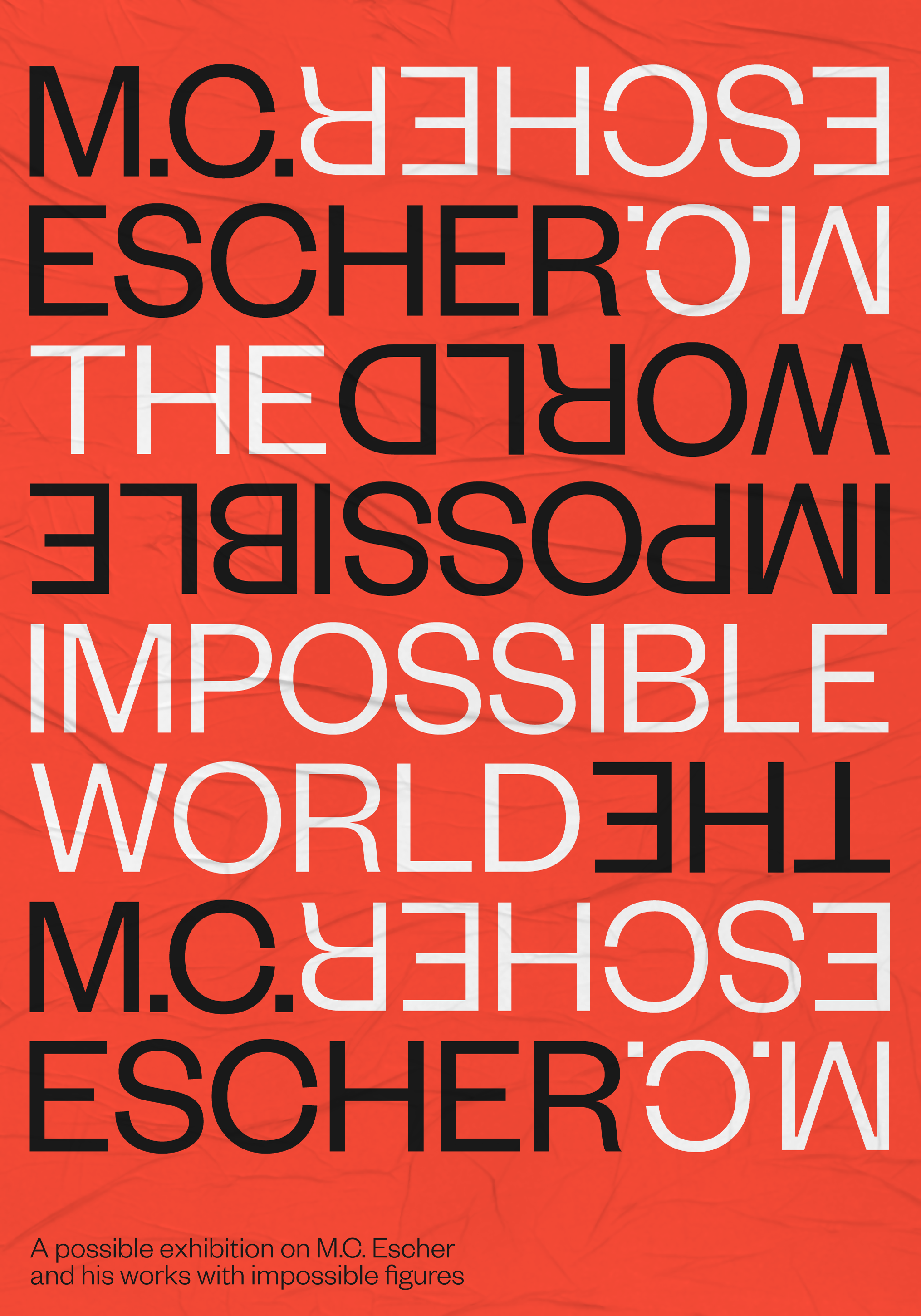
Visual identity for the exhibition The Impossible World, on M.C. Escher and his work with impossible figures.
Projects
Artefakt
Artefakt is a serif font based on the two classical antiqua typefaces Baskerville and Garamond. The capital letters are inspired by the Scotch Modern, while the lowercase letters lean against the Century School Book.
The font is characterized by its asymmetric serifs and square expirations on the terminals. The crooked expression is borrowed from old hand-painted street signs, where you often see small peculiarities in the individual letters.
Projects
Eskild
Eskild is a monoline grotesque font, inspired by Danish street signs from the period 1955-1978. The letters are characterized by their circular terminals and generally friendly and naive mode of expression.
